Do you pay any attention to the title pages in your books, or do you just skip past them to get to the text? Most of today’s books have the title and author printed right on the cover or the dust jacket. Unless you need to complete a citation, you might not need to bother with checking publication information.
But title pages are fascinating! They can tell us a lot about the history of print, and how tastes have changed over time. In the rare book collections, we have title pages that range from unornamented text to elaborate baroque engravings that are stuffed with symbolism. Let’s take a look at some examples.
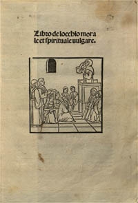
In very early printed books, it wasn’t unusual for books to not have a title page at all. Instead, information such as the title, the date and place of publication, and the printer appeared in the colophon, which appeared at the end of the book. Although proper title pages became more common in the 1460s and 1470s, they were often very basic. This was because they were often seen as a nothing more than a convenient wrapper that prevented the main text block from getting dirty.
Let's see how this works. On the left is an early title page from one of our incunables (remember, an incunable is a book printed prior to 1501!). Even with the woodblock illustration it's still very basic, and only lists the title.
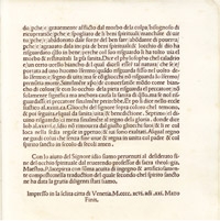
On the right we have the very last page of text, with the colophon at the bottom. That tells us the date and place of publication. We still don’t see the author or the name of the printer, but it’s not unusual for some pieces of bibliographical information to be missing from very early printed works.
Let’s jump forward about forty years and look at this title page for an early modern edition of Hippocrates’ writings. It was published in 1538 by Hieronymous Froben of Basel. Most of the information we would expect is now there: we have the title, the author, the publisher’s name and location, and the date of printing. The image of two snakes twining around a staff is Froben’s printer’s mark. These devices told readers which printer was responsible for producing a book, so if you saw this mark, you would know it came off of Froben’s press.
This is still simple, but it has more decorative elements than we find on the incunable. As time went on, printers began to realize that title pages had potential in marketing books. When you were buying a book, you were buying the printed sheets, not a bound product like today. Today the covers are what catch our eye in a bookstore; hundreds of years ago it would have been a beautiful title page that stood out and appealed to buyers.
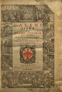
Even this title page is pretty bare bones, though, compared to some of the others we have. Look at this title page for an edition of Galen’s works dating from 1597. The basic bibliographic information – author, title, printer, date and place of publication – is there in the center, but the most striking feature is definitely the beautiful, highly detailed woodcut border. This was quite common in the 16th century, and we have several examples of this in our collections. Sometimes the ornamentation is purely decorative, consisting of scrolls and flowers, but it can also be related to the content of the work. If you look closely at this example, you'll see that the images in the border are all related to Galen and medicine.
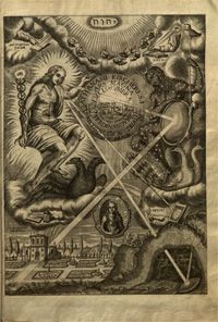
From the mid-16th century onward, you also start to see something called an engraved title. These were elaborate copperplate engravings that were inserted into books after the main text block had been printed. Athanasius Kircher’s Ars magna lucis et umbrae from 1646 has both a printed title page and an additional engraved title. The printed title on the left is certainly nice – look at all the different fonts! – but is maybe not what you’d call eye catching. The engraved title, on the other hand, definitely is.
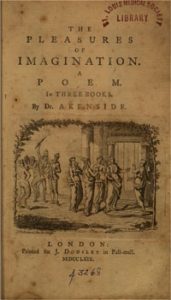
As we can see from the title page for Mark Akenside’s The Pleasures of Imagination on the left, in the 18th century title pages were less baroque. It has an engraved illustration, but it looks practically minimalist next to the Kircher.
And on the right we have this 19th century title page from Wardrop’s Essays on the Morbid Anatomy of the Human Eye. It has all the bibliographic information we want, and presents it to us in the most straightforward way possible. There are no aggrandizing statements about the content of the work, no elaborate borders and illustrations. Just a straightforward statement of what the work is, and who is responsible for it.
So which style do you prefer? Something elaborate and symbolic like the Kircher, or something more simple, like the Akenside or Kircher?

